HealthTech · Digital design system

Jude

Building a scalable design system with Jude’s team, creating shared foundations and reusable components for its website and ecommerce experience.

Design systemEcommerceUI
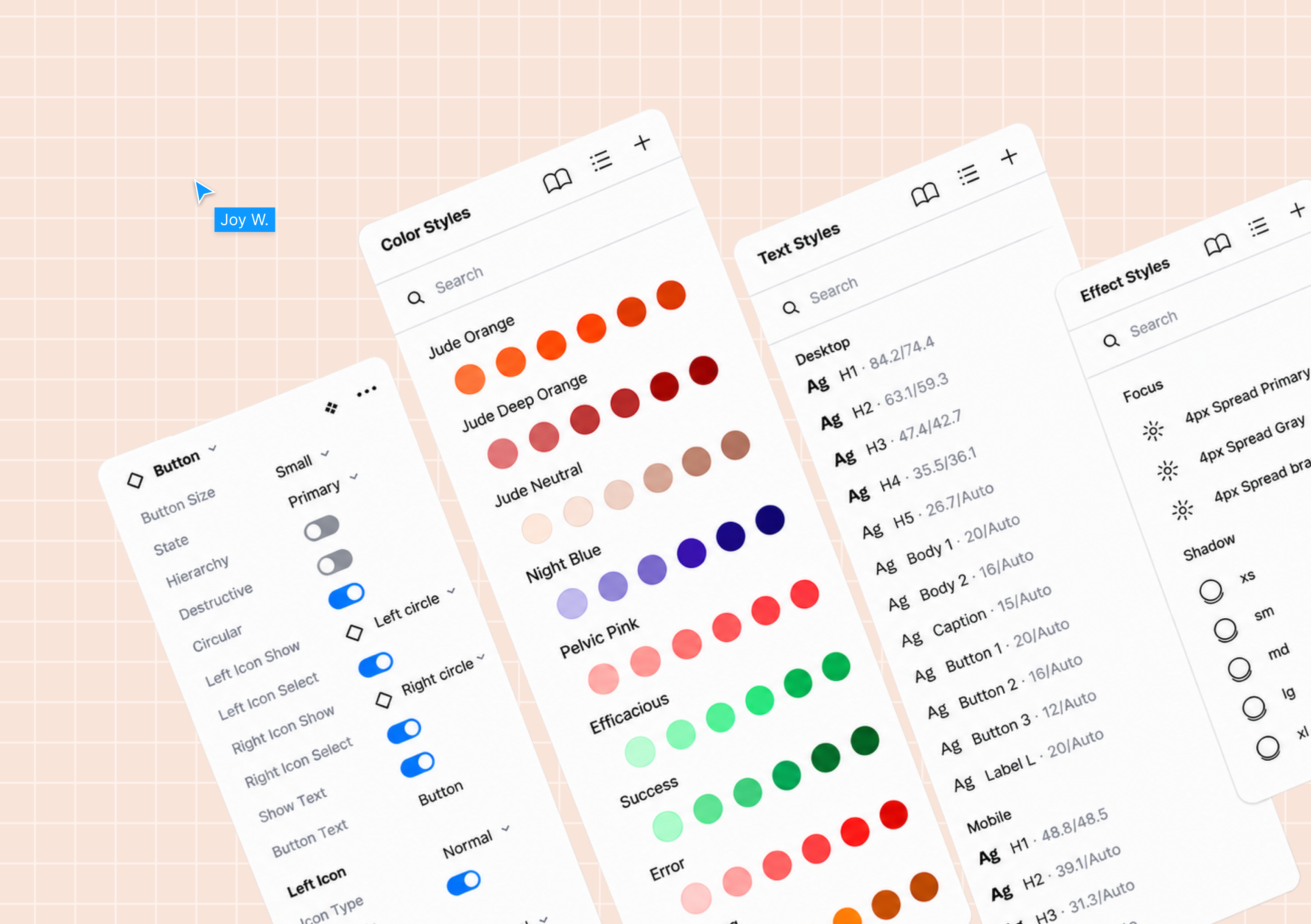
Jude design system component panels showing colour, typography, effects and button variants
01 / Overview

From early traction to a scalable digital experience.

Jude spent its first year trading with a simple website and branding created at startup speed. Strong sales helped the team secure funding for a full rebrand and a more considered digital ecosystem.

An agency developed the new identity. I joined as the sole designer to translate it into a responsive design system and ecommerce experience, working with the Head of Product and engineering team. A junior designer joined later as the work expanded.

My roleSole designer at the start
Engagement10 months
TeamHead of Product, Branding agency and Engineering team
ScopeDesign system and key ecommerce pages
The challenge

A strong identity needed a digital language.

Jude already had a distinctive brand identity. The next task was to make it work across real interfaces: responsive type, purposeful colour, consistent spacing, components and interaction states. Without that layer, every new page would need to interpret the brand again.

Working closely with the Head of Product and the Jude team, I built the design system from scratch while the product and ecommerce experience continued to evolve.

The system / 01

A responsive visual foundation.

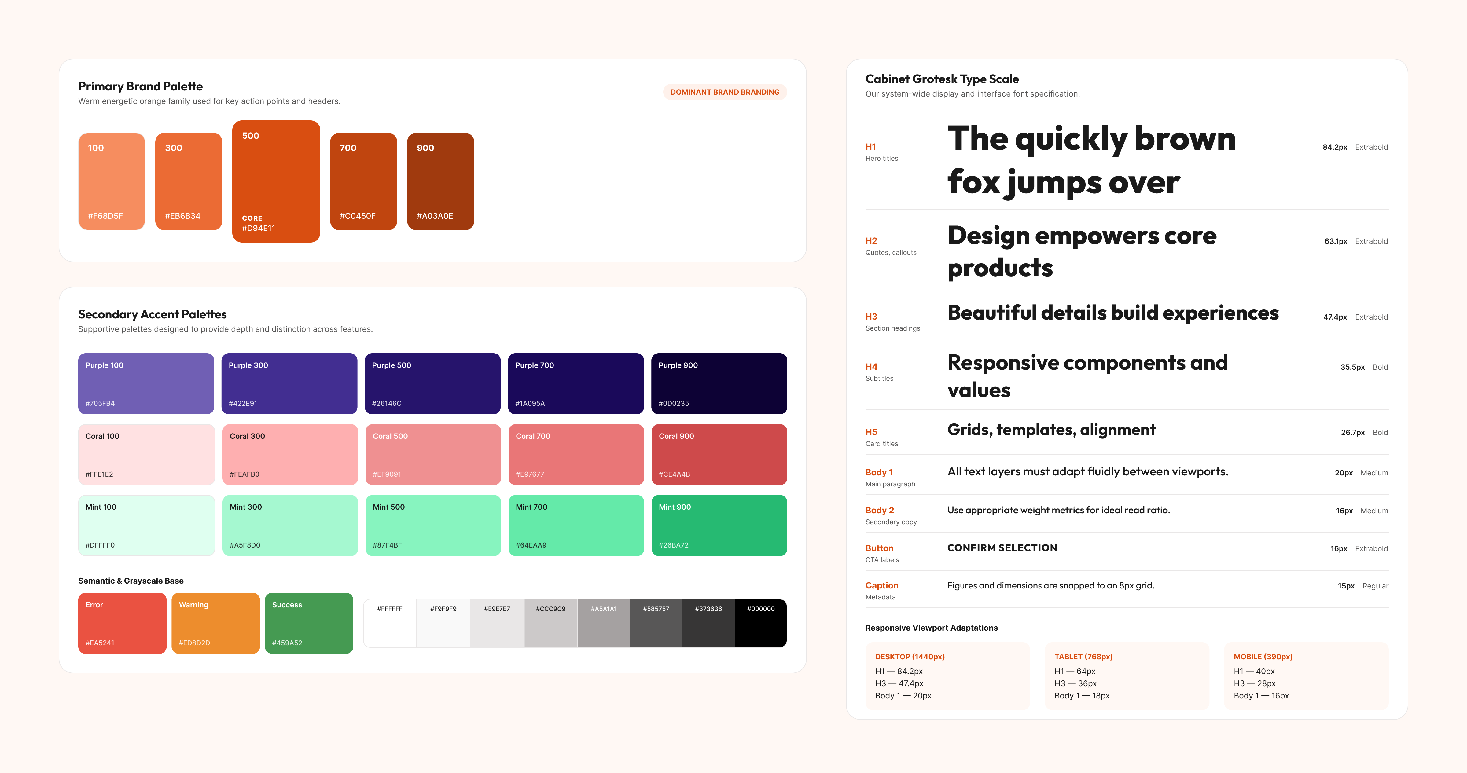
I converted the brand palette into usable colour scales and semantic roles, then defined a responsive type hierarchy. The aim was to keep Jude recognisable across screens while giving the team precise styles to design with.

Jude design system colour palettes, semantic colours and responsive typography scale
Primary, accent and semantic colours alongside desktop, tablet and mobile type styles.View full resolution ↗
02

Structure across every breakpoint

I defined grids, containers, breakpoints and spacing rules for desktop, tablet and mobile. These decisions gave the team a common way to compose pages, while leaving enough room for the brand to feel energetic and expressive.

Responsive grids · Containers · Spacing
03

Interaction states built into components

Buttons, links, forms and other controls needed to work beyond their default appearance. I created reusable variants and interaction states so designers could show behaviour clearly and build new journeys from established patterns.

Components · Variants · States
04

A shared library for product and marketing

I organised the Figma files around foundations, reusable interface components and marketing patterns. Clear naming and a consistent setup made the system easier to find, maintain and extend as more people contributed to the digital experience.

File structure · Naming · Ways of working
05

Patterns for more complex journeys

I expanded the library into cards, dropdowns, form controls and other patterns that could support richer journeys. Each component was built to be consistent enough to reuse and flexible enough for the different needs of Jude’s site.

Cards · Forms · Reusable patterns
Navigation / 06

Making the next step easier to find.

Jude’s navigation had to serve two different intentions: people ready to shop, and people still learning which product might be right for them. I explored how to make both routes clear without turning the header into a long list of competing links.

01 / Review

Question the hierarchy

I audited the existing navigation and looked at how other brands balanced shopping, education, credibility and guidance. The review raised practical questions about the prominence of Reviews, the unclear “Get started” action, and where a referral offer belonged.

02 / Explore

Give each path a job

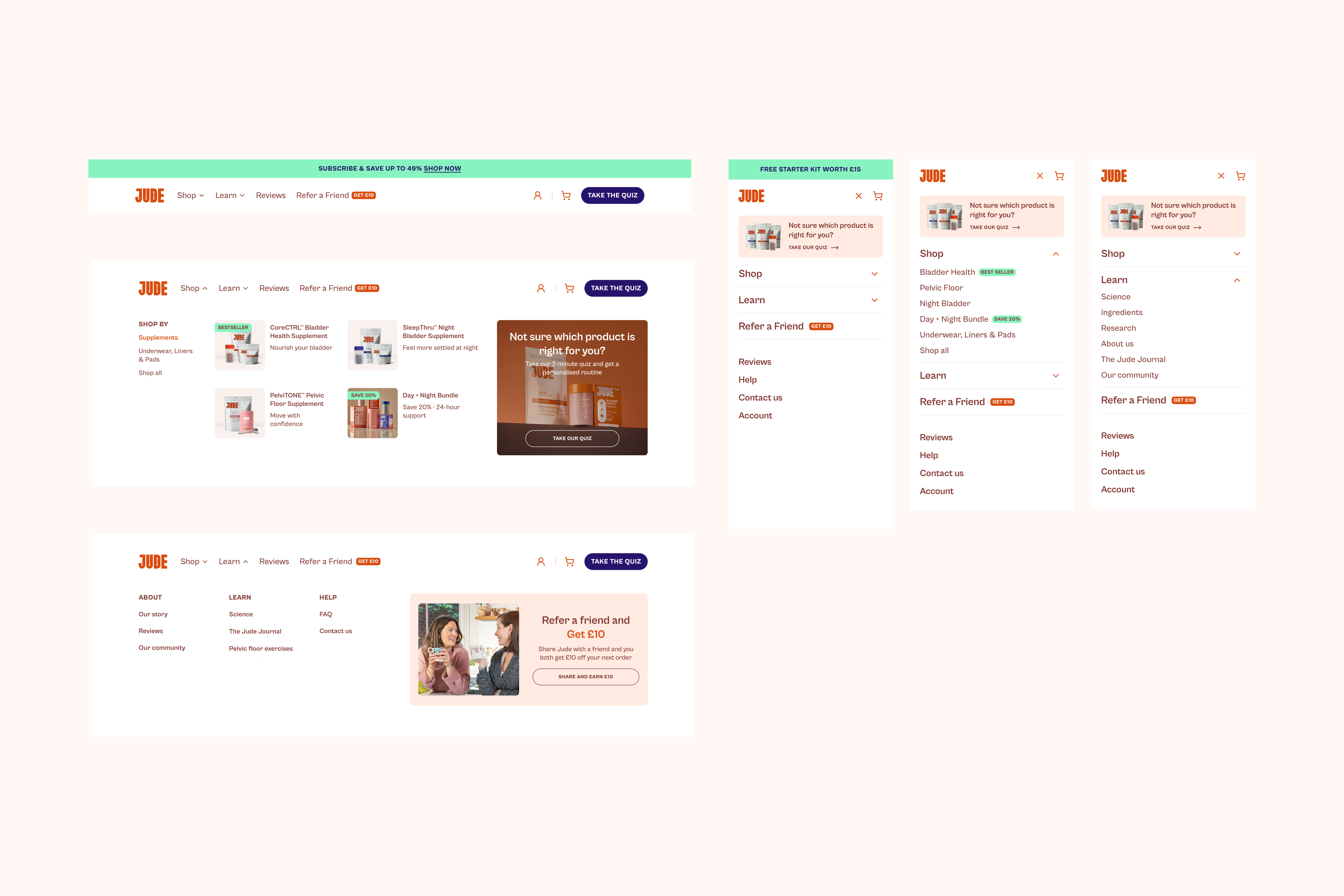
Desktop and mobile options tested clearer Shop and Learn groupings, product-led previews, a more explicit quiz prompt and space for the referral offer. I refined the menus to show useful detail without making them feel crowded.

03 / Resolve

Design for both screen sizes

The direction makes products easier to scan on desktop and uses compact, expandable sections on mobile. The quiz stays visible as a helpful route for someone who does not yet know what to buy.

Before / the hierarchy to rethink
JUDEShopAbout usReviewsGet started
Equal-weight linksReviews and About us competed for prime navigation space.
Unclear next step“Get started” did not say what would happen next.
Guidance to surfaceProduct discovery needed a clearer route for undecided shoppers.
After / routes with purpose
JUDEShop ↓Learn ↓ReviewsTake the quiz
SHOPFind productsCategories and product previews make the range easier to scan.
LEARNBuild confidenceScience, stories and advice have a distinct place.
Not sure what fits?Take the quiz →

A simplified comparison of the questions raised in the navigation audit and the final direction—not a reproduction of the earlier site.
Final Jude navigation designs, showing desktop Shop and Learn menus and mobile expanded menu states
Selected desktop and mobile navigation states.View full resolution ↗
Putting it to work

The system moved into the shop.

Later in the engagement, I used the foundations and components to design key ecommerce pages. That work tested whether the library could do its most important job: support real customer journeys, not just look complete in Figma.

The result of my ten months was a shared digital foundation, a more organised way of working, and commerce designs shaped by the same rules. I’ll add more visual examples of the responsive layouts, component states, library and ecommerce pages as the project documentation develops.

The result

A system the team could use.

One digital language

Colour, type, layout and interaction rules brought the brand into a consistent digital experience.

Reusable by design

Tokens, components and organised files gave the team a clearer starting point for new work.

Applied to commerce

Key ecommerce pages put the shared foundations into real customer journeys.

Next projectYond ↗